ImageGalleryComponent: Difference between revisions
| Line 4: | Line 4: | ||
==Where to Find== | ==Where to Find== | ||
This Component can be found in the [[Adding to a Page | " | This Component can be found in the [[Adding to a Page | "Add Content to Page"]] section of the [[Toolbar]]. | ||
==Adding to Website== | ==Adding to Website== | ||
Latest revision as of 18:08, 28 November 2013
An Image Gallery component is used for adding a number of images to your site, in a variety of ways.
Where to Find
This Component can be found in the "Add Content to Page" section of the Toolbar.
Adding to Website
After selecting this Component, you will be able to choose exactly where you want to add it!
You will see all available content locations it can be added to - on the current page only (content locations in Gold), on every page (content locations in Red), or on every page under the current page directory (content locations in Blue. For example - if you are editing a page called "About", the blue content locations would allow you to add this component to all pages under the /about/ directory).
Options
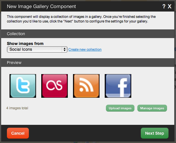
After choosing where this Component will appear, you can configure it by choosing the folder to show images from. You can also create a new folder.
Clicking on the "click here" or "Upload images" link in the Preview area will take you to the File Manager which you can use to upload images from your computer.
Clicking on "Manage images" will take you to the main file manager area with the "Images" filter in place to only show uploaded images.
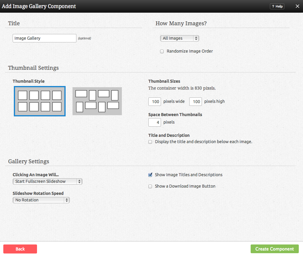
Further configuration can be done before the Component is added.
You can optionally set a Title to be displayed above the Image Gallery content on your page.
The How Many Images to Display? option allows you to choose how the images in this component display on your site. You can choose to show all, or show a number that you define. You can also choose to Randomize Image Order in addition to either case, making them display in random order each time the page is viewed.
Thumbnail Style gives you a graphical representation of how the thumbnail versions of your images will appear in the gallery on your site. Thumbnail Sizes allows you to define the height and width of these. You can also set the Space Between Thumbnails here. These settings are defaulted to reasonable amounts.
The Click Behaviour option will allow you to set what happens when an image in the gallery is clicked on. The choices are:
- Start Fullscreen Slideshow (opens the image clicked to be fullscreen - if more than one image exists, this uses slideshow mode, which opens the image clicked, and allows you to move your cursor over the image to go to the next or previous in the collection)
- Directly open this image (Links directly to the image file)
- Do nothing (clicking on the image will do nothing)
Slideshow Display Items allows you to display titles and descriptions and a download image button, or deactivate these.
Slideshow Rotation Speed gives you the option to choose how long the image will be displayed for before switching to the next one.
Editing
Need to make a change? You can access the settings for this Component again by clicking on the "Settings" button on the Component Toolbar.
Example Sites
An example of this Component can be viewed on the Multimedia page of http://builderexample.com


