GuestbookComponent: Difference between revisions
Created page with "__NOTOC__ Display a guestbook on your site which your visitors can use to leave you a message or log their visit. ==Where to Find== This Component can be found in the [[Addi..." |
No edit summary |
||
| Line 15: | Line 15: | ||
[[Image: | [[Image:Guestbook.PNG]] | ||
The main editing area will allow you to customize the way your guestbook appears on your site - from text size and font, to color and anything else you would want to include to create the perfect guestbook for your site. The visual editor will give you full control over these features, with the ability to manage HTML if required. | |||
'''Note:''' The grey pane on the right side shows a representation of the width you have to work with - it will vary in size depending on the column width of the area you're adding this component to. | |||
==Editing== | ==Editing== | ||
Revision as of 18:07, 14 December 2012
Display a guestbook on your site which your visitors can use to leave you a message or log their visit.
Where to Find
This Component can be found in the "Add Block to Page" section of the Toolbar.
Adding to Website
After selecting this Component, you will be able to choose exactly where you want to add it!
You will see all available content locations it can be added to - on the current page only (content locations in Gold), on every page (content locations in Red), or on every page under the current page directory (content locations in Blue. For example - if you are editing a page called "About", the blue content locations would allow you to add this component to all pages under the /about/ directory).
Options
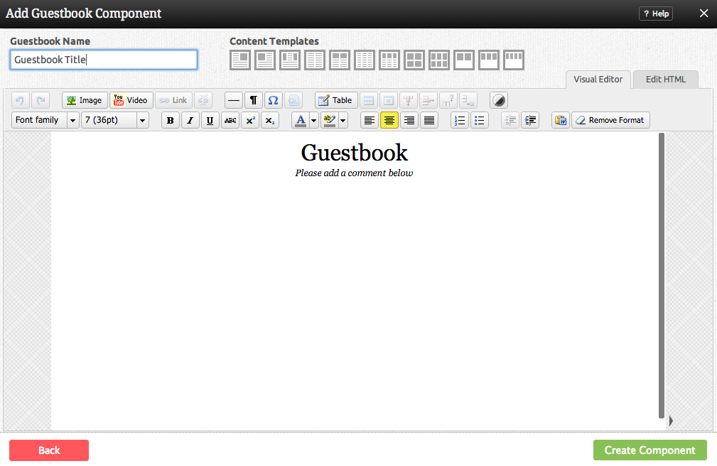
The main editing area will allow you to customize the way your guestbook appears on your site - from text size and font, to color and anything else you would want to include to create the perfect guestbook for your site. The visual editor will give you full control over these features, with the ability to manage HTML if required.
Note: The grey pane on the right side shows a representation of the width you have to work with - it will vary in size depending on the column width of the area you're adding this component to.
Editing
Need to make a change? You can access the settings for this Component again by clicking on the "Settings" button on the Component Toolbar.
Example Sites
An example of this Component can be viewed on the Web Tools page of http://builderexample.com

